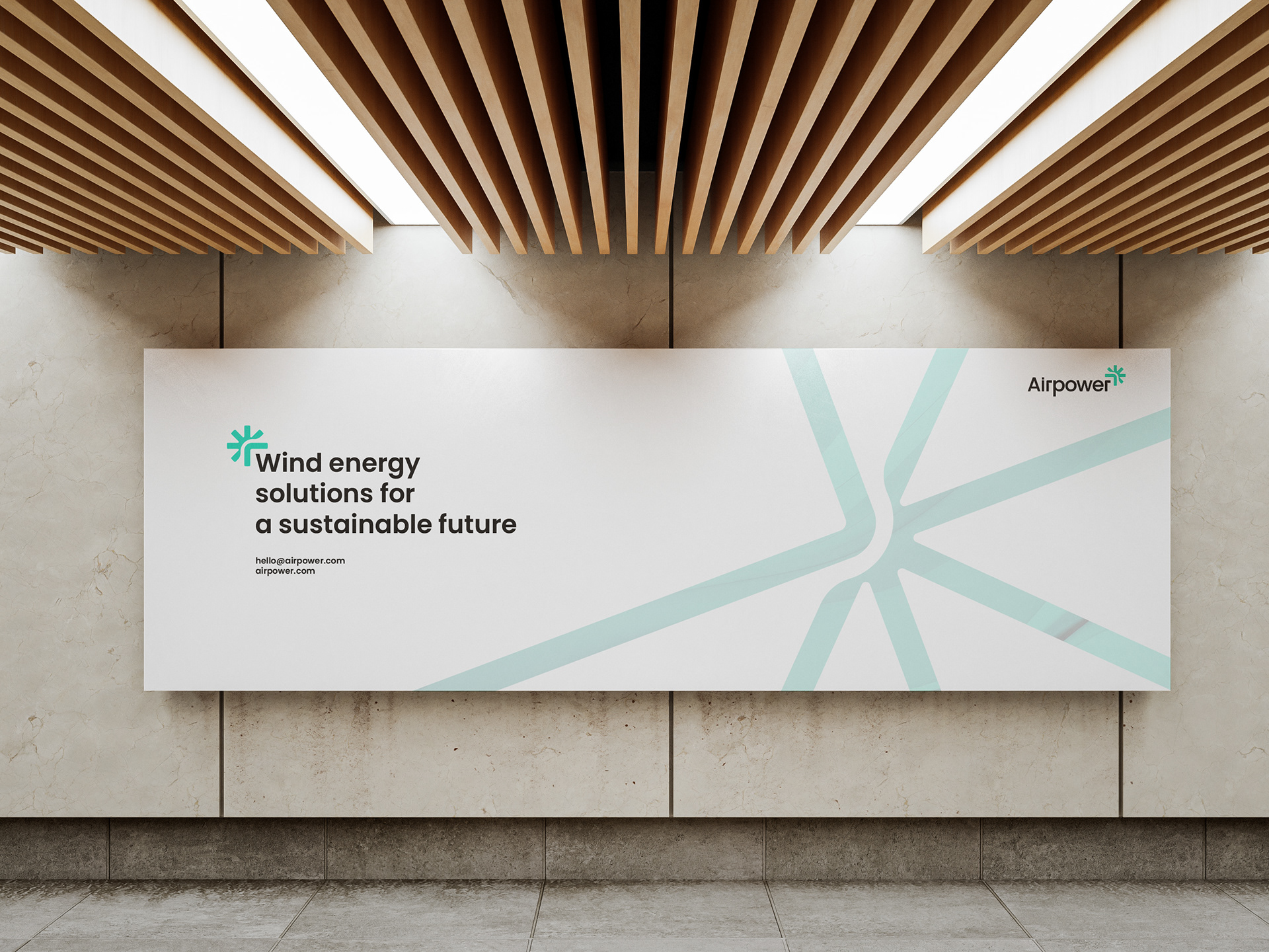
About the Brand
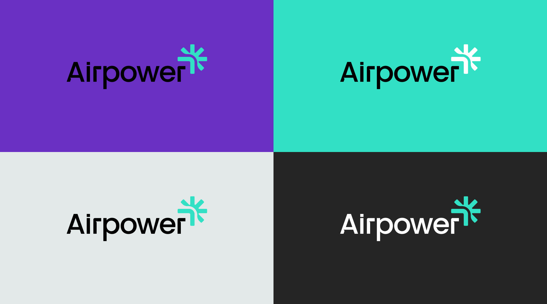
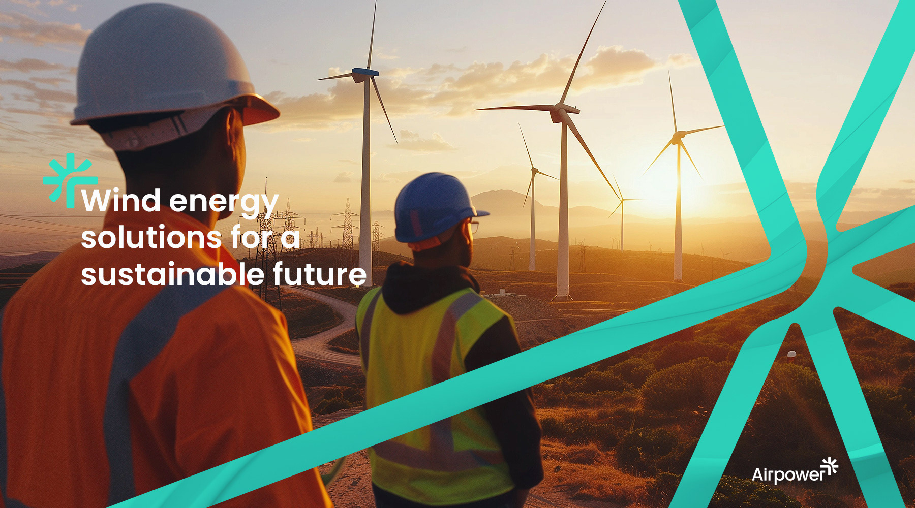
A leader in wind energy solutions, sought a visual identity marked by strict minimalism. Our response culminated in a symbol, harmonizing the company's initial "A," dynamic wind turbine blades creating an energy burst leaves reflecting ecological consciousness, all meticulously aligned with Airpower's core activities.
The typographic design, featuring cut-outs from the logo, reinforces the brand's identity, with "Air" embodying wind and "Power" symbolizing energy.
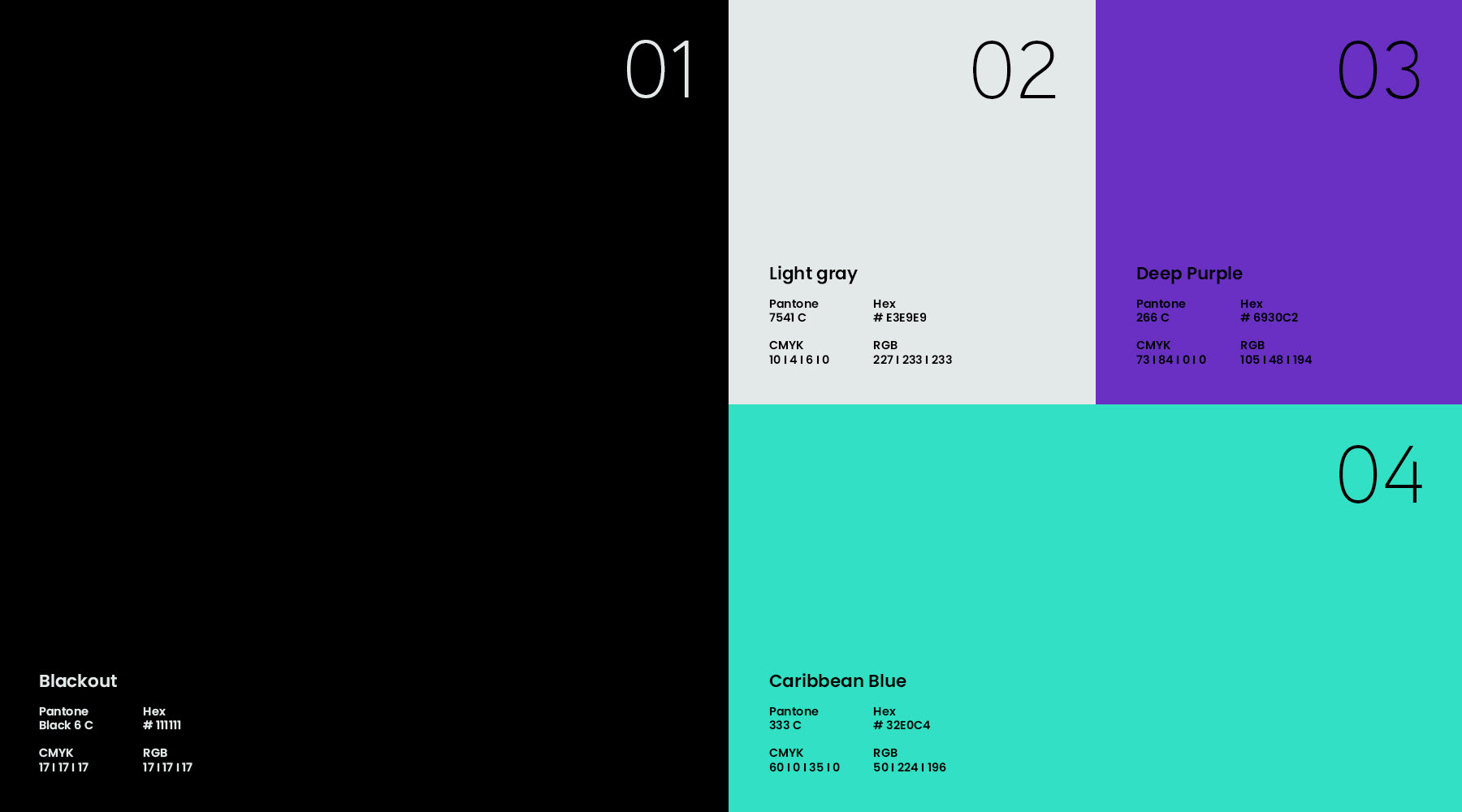
Signature colors were meticulously chosen for their significance:
- Blue: A nod to technology and the vast sky.
- Black: Conveys austerity and premium quality, while subtly highlighting the three states of the sky: clear, cloudy, and twilight.